I’m Caleigh and I have graduated with a degree in graphic design from Texas A&M-Corpus Christi. For me, graphic design is the ability to create real and authentic branding for my fellow creatives and local small businesses. I also love working with color and incorporating my hand lettering into any work that I can. When I am not designing, I am photographing graduating seniors and couples in love or photographing passion projects. And when I am not doing #allthethings, you can find me spending time with my family and my sweet fur babies or somewhere at a coffee shop.
“Let the beauty of what you love, be what you do.”
Artist Statement
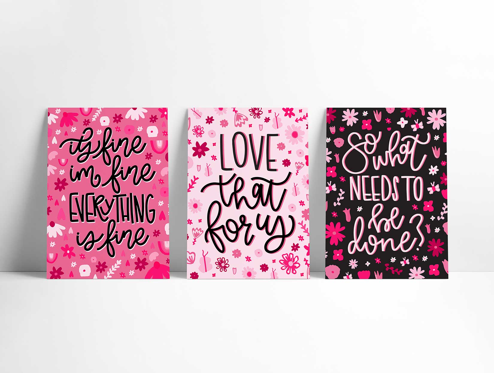
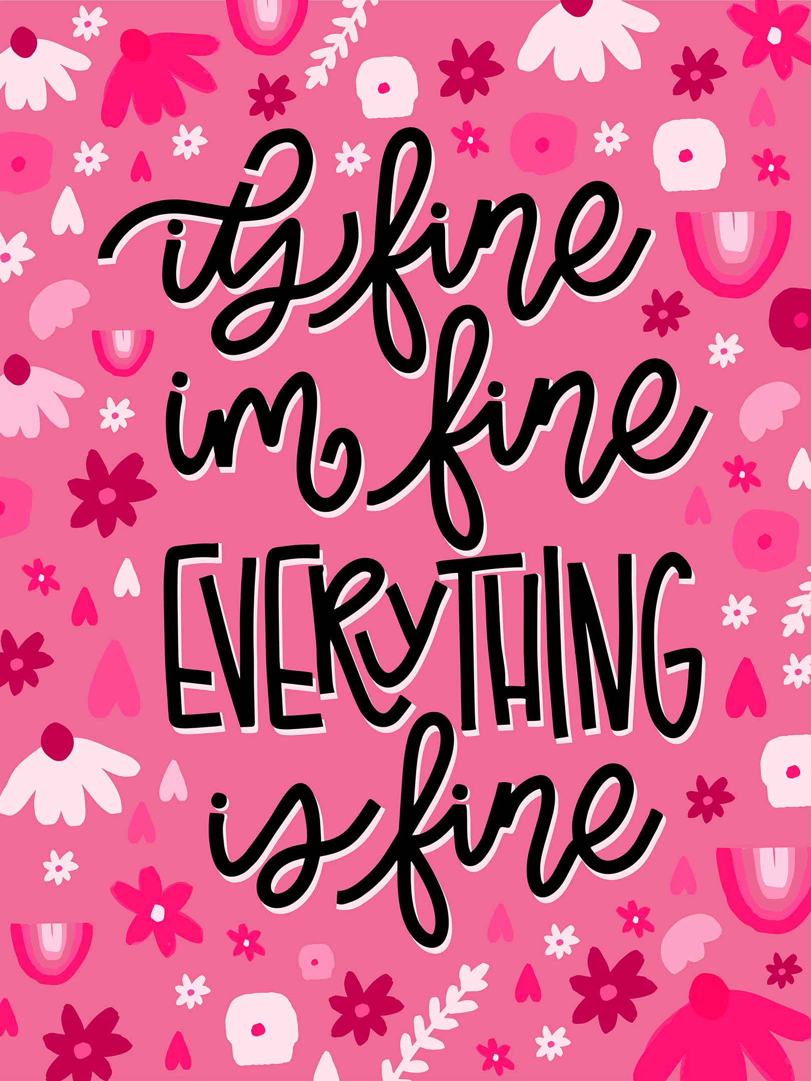
Hi there, my name is Caleigh Knipling and I am excited to share my graphic design works with you. Throughout the last four years, I have found a love for letterforms, specifically those that are done by hand. For my series, I have chosen to showcase my hand-lettering in the form of the never-ending thoughts and phrases that occasionally, okay frequently, pass through a young designer’s mind and mouth, specifically my own.
With the help of those closest to me, I have selected three of my most common phrases. Now, rather than breaking each of these down for you and telling you how they play a role in my life, I am choosing to leave that open so that you can interpret these on your own. Maybe you’ll envision me at my desk having a minor panic and then shouting one of these phrases to relieve a bit of stress. Maybe you’ll recall a time that you can vividly feel and see yourself doing the same. Or maybe you’ll adopt one of these and take it to your very own everyday life, highly recommended.
The process of creating these posters included brainstorming, sketching, and then bringing my ideas to life through Procreate and Adobe Illustrator. With a primary focus on the letterforms, I spent time discovering how each piece would fit together, overlap, or simply sit together and look pretty. Once all the phrases and lettering were established, it was time to add small details to distract from the phrases and add a little bit of beauty to bring the viewer in. The overall goal is for the viewer to be drawn in by beauty and then left with a small thought of reality.
Overall, I had so much fun creating something for myself as my last piece of graphic design at the Island University.
I’m Caleigh and I have graduated with a degree in graphic design from Texas A&M-Corpus Christi. For me, graphic design is the ability to create real and authentic branding for my fellow creatives and local small businesses. I also love working with color and incorporating my hand lettering into any work that I can. When I am not designing, I am photographing graduating seniors and couples in love or photographing passion projects. And when I am not doing #allthethings, you can find me spending time with my family and my sweet fur babies or somewhere at a coffee shop.
“Let the beauty of what you love, be what you do.”
Previous
Next
Artist Statement
Hi there, my name is Caleigh Knipling and I am excited to share my graphic design works with you. Throughout the last four years, I have found a love for letterforms, specifically those that are done by hand. For my series, I have chosen to showcase my hand-lettering in the form of the never-ending thoughts and phrases that occasionally, okay frequently, pass through a young designer’s mind and mouth, specifically my own.
With the help of those closest to me, I have selected three of my most common phrases. Now, rather than breaking each of these down for you and telling you how they play a role in my life, I am choosing to leave that open so that you can interpret these on your own. Maybe you’ll envision me at my desk having a minor panic and then shouting one of these phrases to relieve a bit of stress. Maybe you’ll recall a time that you can vividly feel and see yourself doing the same. Or maybe you’ll adopt one of these and take it to your very own everyday life, highly recommended.
The process of creating these posters included brainstorming, sketching, and then bringing my ideas to life through Procreate and Adobe Illustrator. With a primary focus on the letterforms, I spent time discovering how each piece would fit together, overlap, or simply sit together and look pretty. Once all the phrases and lettering were established, it was time to add small details to distract from the phrases and add a little bit of beauty to bring the viewer in. The overall goal is for the viewer to be drawn in by beauty and then left with a small thought of reality.
Overall, I had so much fun creating something for myself as my last piece of graphic design at the Island University.